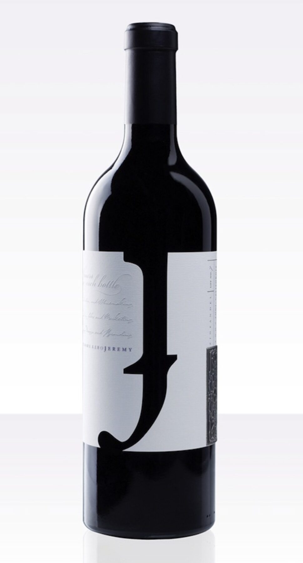


The unique full wrap dieline forms the phonetic ” J ” for Jeremy (why phonetic? “because we want to stimulate all your senses when experiencing these wines”), which also reads as a lowercase ” f ” alluding to the tagline “forty thousand hours in each bottle” when the wine is poured (invert the bottle). This duality is reinforced in the brand logotype, and further pushed in the package details & nuances (blind embossed typographic texture balanced with a hand applied vintage metal tag; contemporary minimalism meets old world tradition). This duality is a key symbolic element as it personifies both Jeremy’s personality and approach to wine making